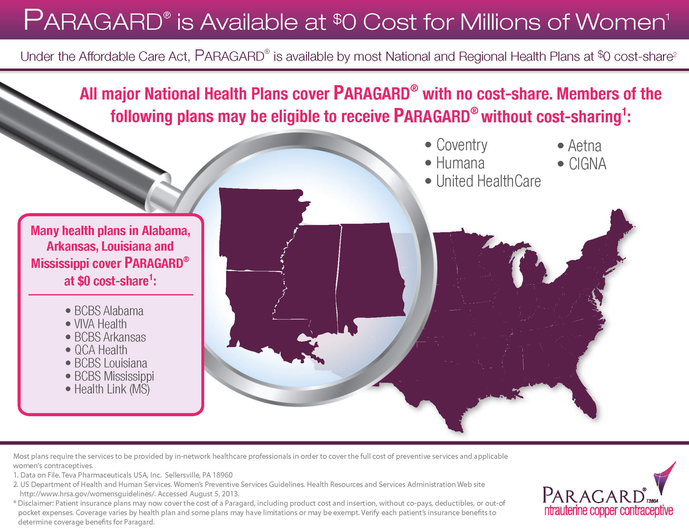
I’ve had the privilege to collaborate with Teva Pharmaceuticals on an extensive array of projects. Ranging from crafting marketing and training videos to designing and executing websites, I’ve had a lot of challenging and engaging projects with them. Some of these projects are featured below, but a good deal of them are intended solely for internal use and are not allowed to be shared.
Commercial Operations
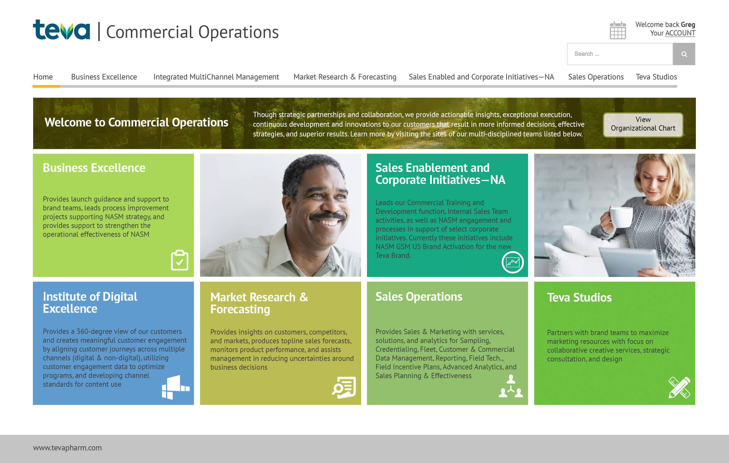
The Teva Commercial Training was looking to modernize their Commercial Operations website. They wanted a clean look that still incorporated the various areas of interest, but also reduced the overall footprint and was more optimized for mobile devices. I used a combination of Adobe Photoshop and Illustrator on this project. I worked with the development team to implement this internally, but I didn’t contribute to any of the programing involved.
BEFORE
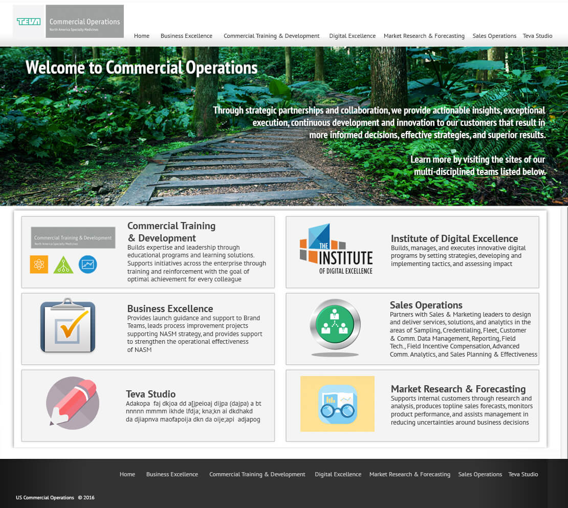
AFTER
Women's Health Access Solutions
The Teva Women’s Health team was looking for a site that could provide valuable information for both patients and providers. Using Adobe Photoshop and Illustrator, I designed a site to fit their needs. I was also just in-charge of the design for this site and not the programing. The three sites contain over 100 pages, but here are just a few examples:
Your journey starts at the portal site. This is where you can get information about Women’s Health Access Solutions, Teva’s history, or contact information. When you’re ready, you can choose whether you’re a patient or provider and be taken to the appropriate site.
PORTAL HOME
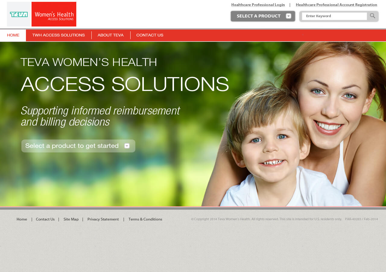
PORTAL INTERIOR

If you select the patient portal, you are taken to a site that provides information about healthcare coverage, specific products, and patient assistance.
PATIENT HOME
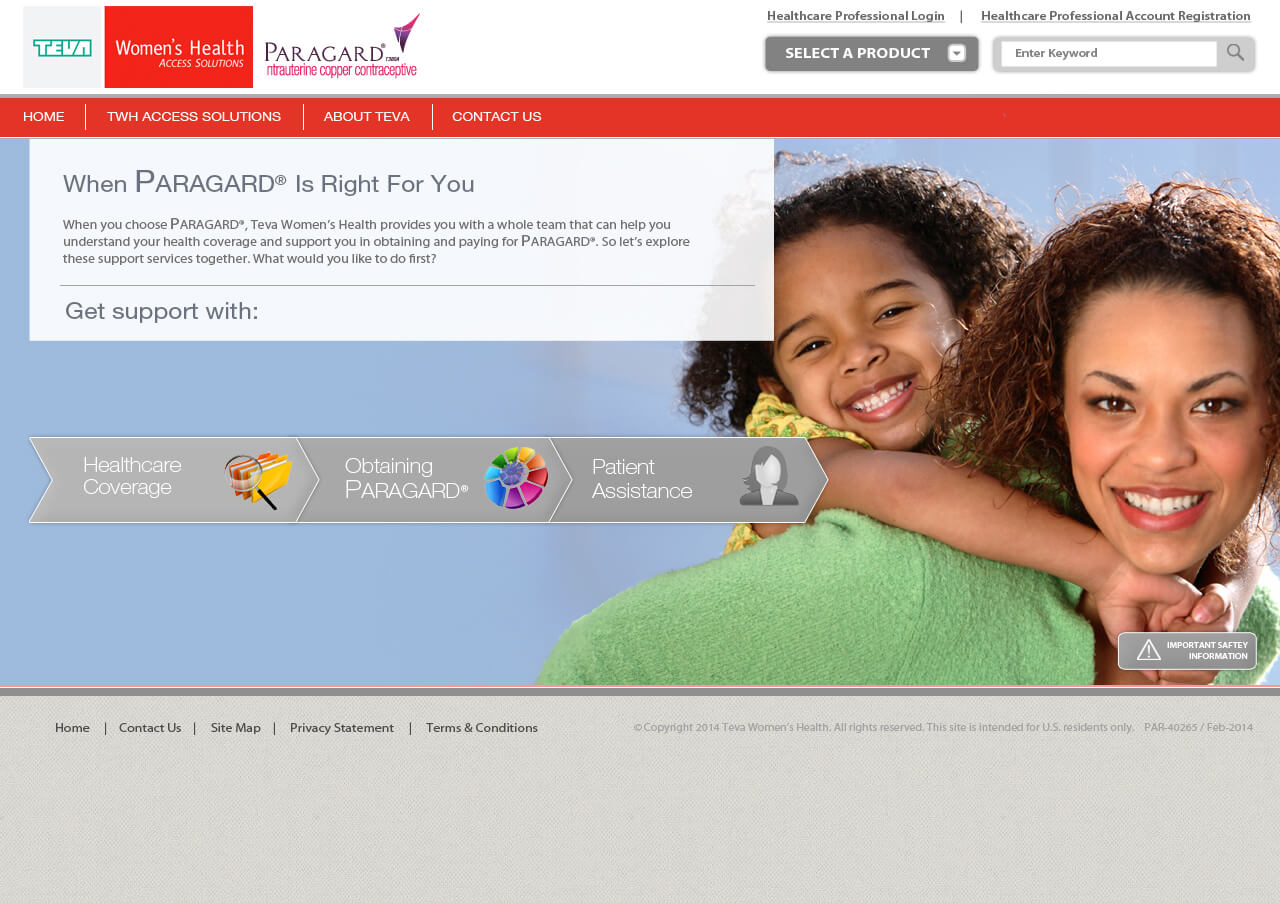
PATIENT INTERIOR
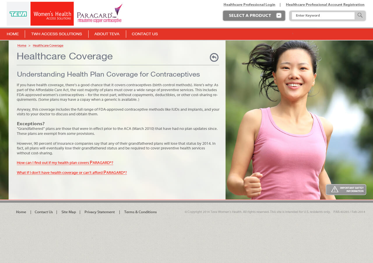
If you select the provider portal, you are taken to a site where providers can access certain forms and documents, benefits verification, ordering and reimbursement, and other information.
PROVIDER HOME
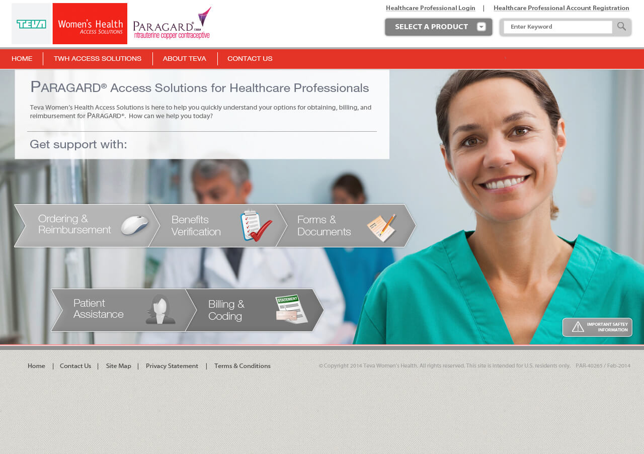
PROVIDER INTERIOR

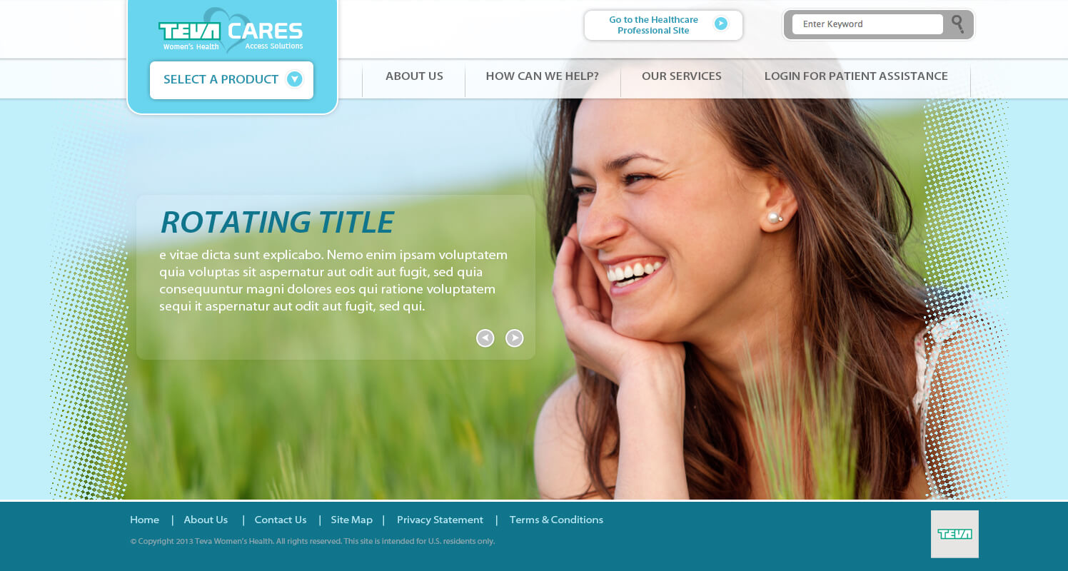
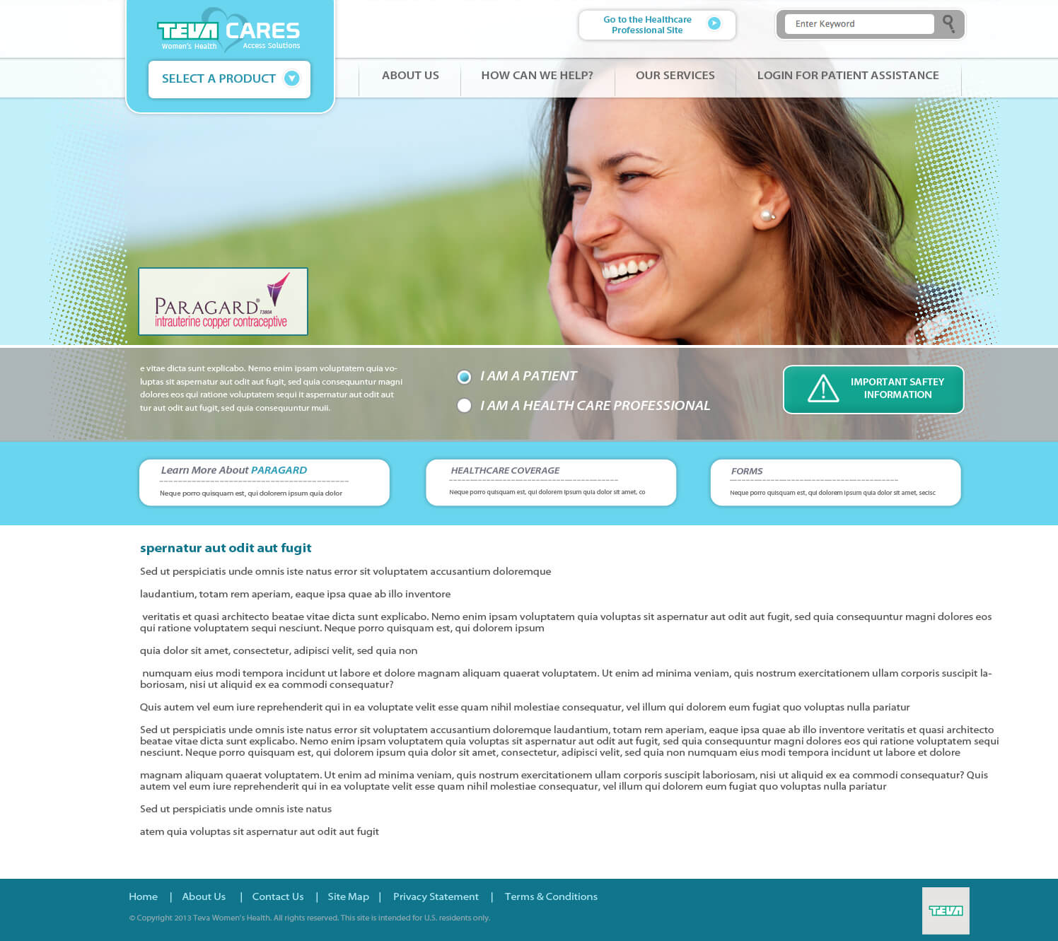
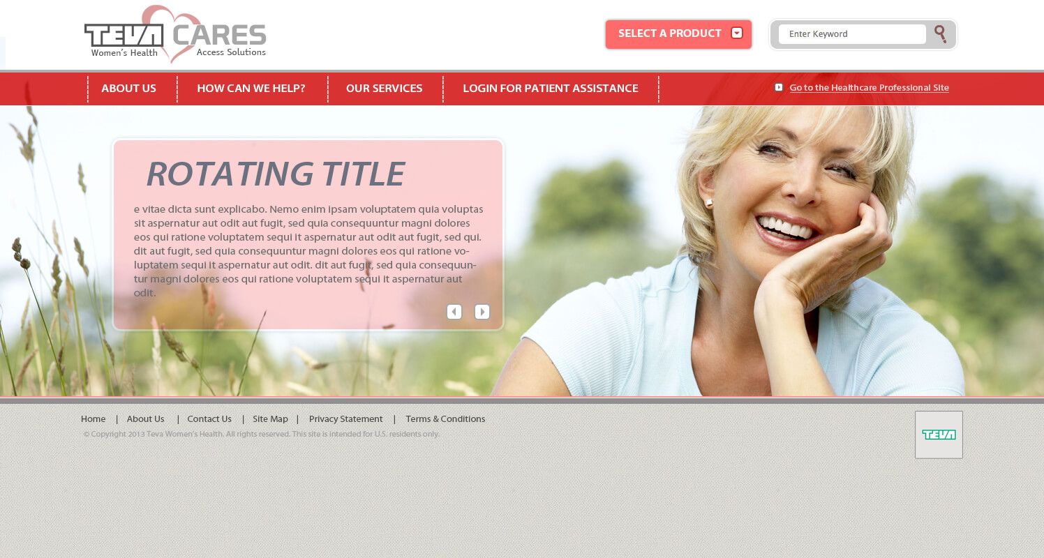
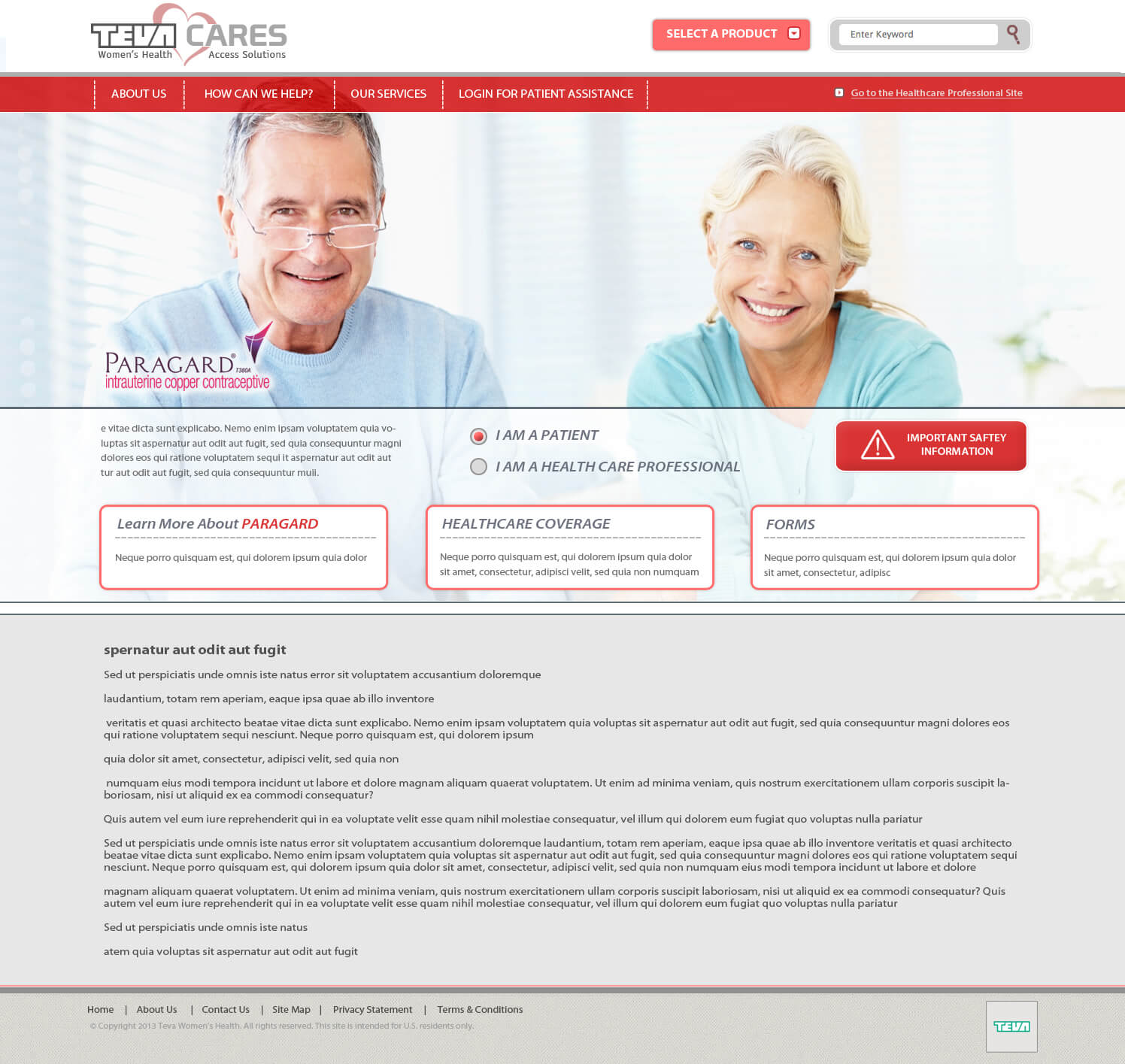
Teva Cares
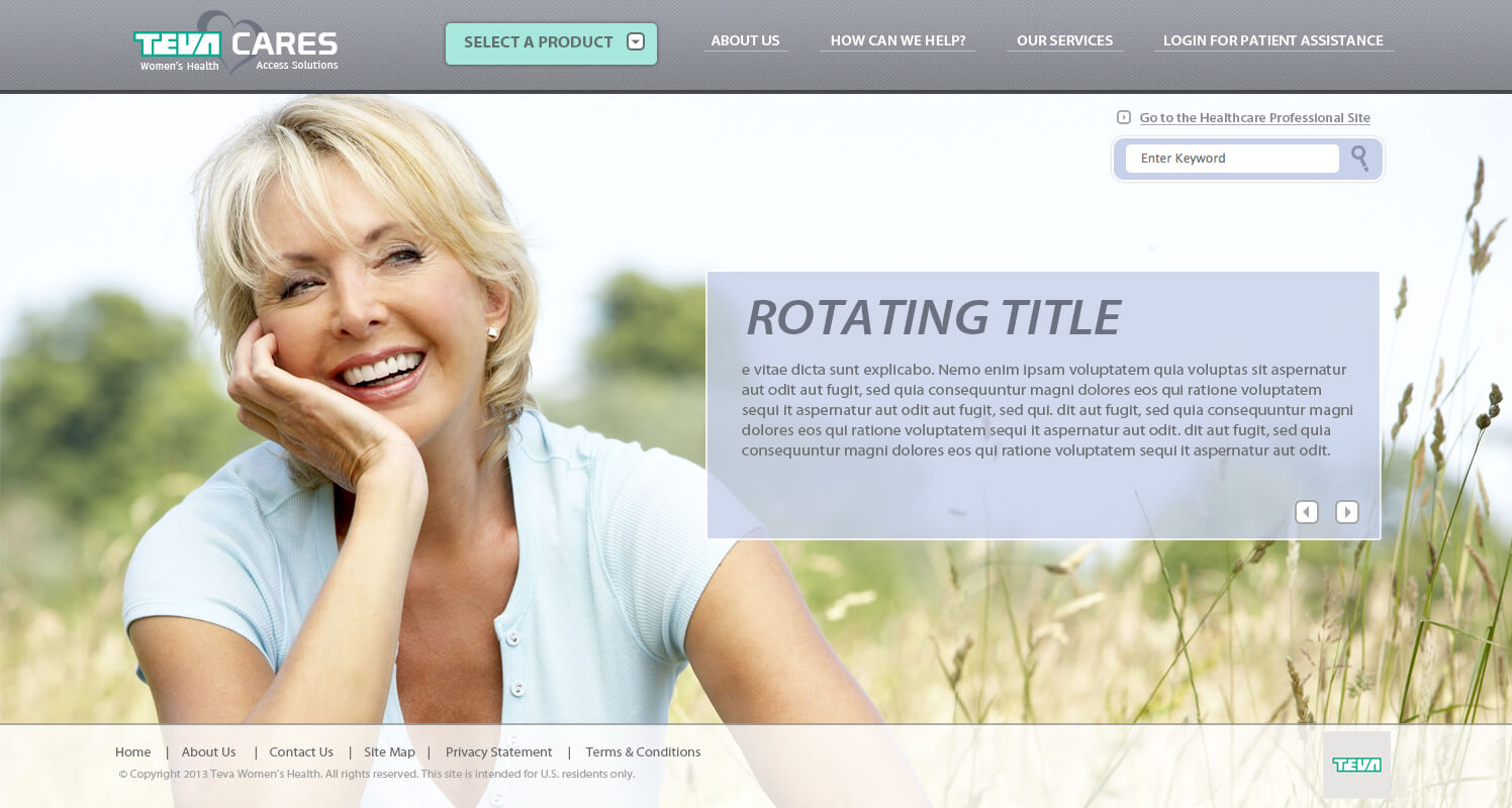
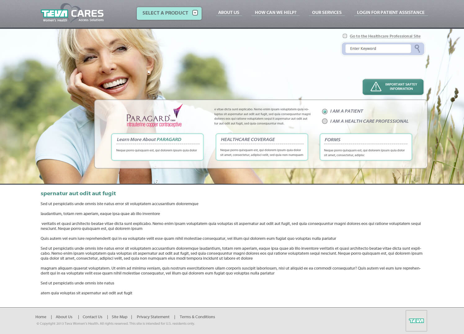
Teva Cares was the first iteration of what would become Access Solutions. I worked with Teva Women’s health to create the new logo and provide various website mockup designs. Although these designs would never see the light of day, I still wanted to showcase them here.
MOCKUP #1 HOME
MOCKUP #1 INTERIOR
MOCKUP #2 HOME
MOCKUP #2 INTERIOR
MOCKUP #3 HOME
MOCKUP #1 INTERIOR
Paragard Care Cards
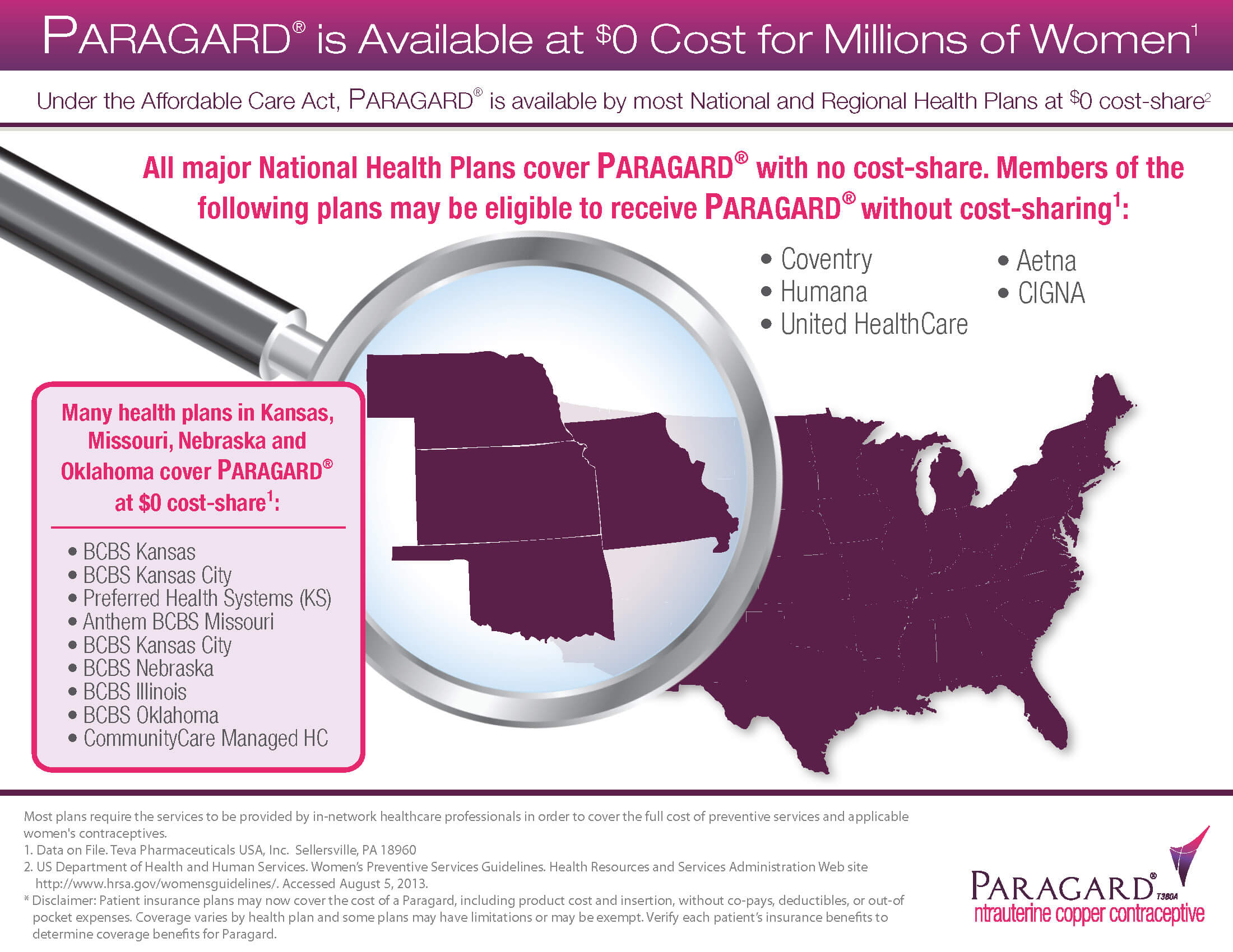
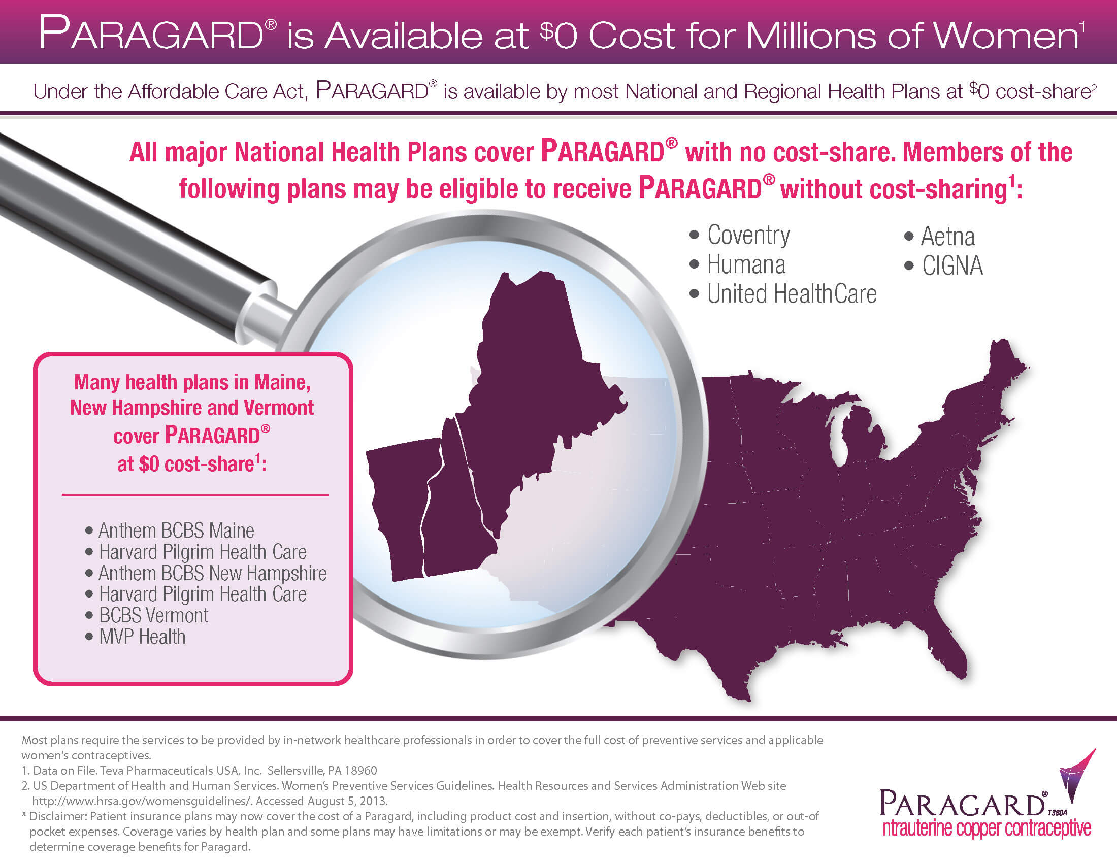
The Teva and Paragard teams were looking to have care cards created and printed off for distribution across the country. What made these unique is that the front of each card remained the same, but the back included a different set of states depending on whichever region they would be sent to. This was to provide local healthcare provider information on each card. I used a combination of Adobe Photoshop and Illustrator on this project.
FRONT

BACK
BACK
BACK
